


Hi, it’s Victoria…I’m delighted to be here on the Ranger Blog with you today. My journal pages are often inspired by seeing or hearing something that triggers my imagination. I found this great quote by the cinematographer Conrad Hall, and knew it would sit beautifully with an image of an abandoned, rusty American car I’d seen…and the page was born! Dylusions paints are perfect for enabling me to create backgrounds that echo the textures and colours for the images I like to use – I love their versatility.

Beauty in Imperfection by Victoria Hills
- Materials
- Instructions
- Dylusions Square Creative Journals
- Dylusions Paint : Dirty Martini, Slate Grey, Melted Chocolate, Fresh Lime, White Linen, Black Marble
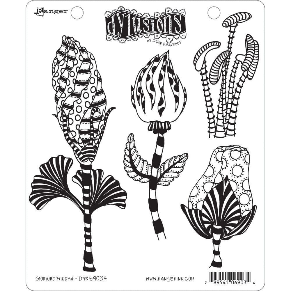
- Dylusions Stencils : Holes, Dotted Flowers, Leaf Flourish
- Dylusions Journal Block
- Dylusions Clear Stamps : Clearly Alpha
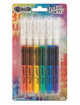
- Dylusions Paint Pens : White Linen, Black Marble
- Ranger Non-Stick Craft Sheet™
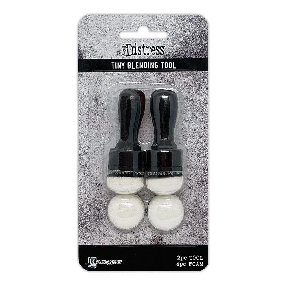
- Ranger Mini Blending Tool with Foam
- Tim Holtz® Distress Collage Mediums : Matte
- Tim Holtz® Distress Collage Brushes
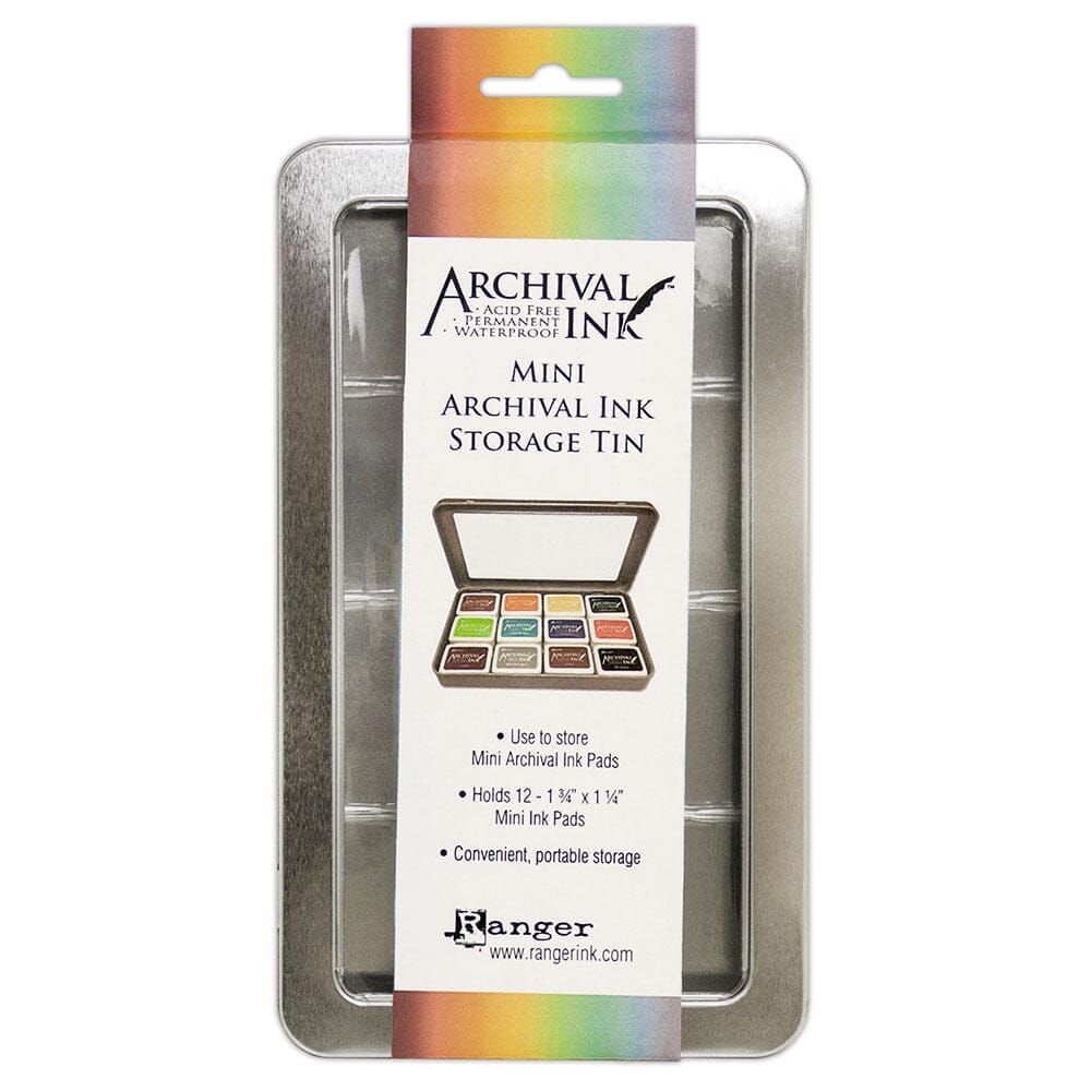
- Archival Ink™ #0 Pads : Jet Black
- Ranger Mini Misters
- Ranger Craft Tags : #8 Manila
- Dina Wakley Media Palette Knife
- Tim Holtz by Tonic Studios Scissors
- Fine detail and 1” flat paintbrushes
Instructions

Step 1: Choose an image and quote that really inspires or resonates with you. My image was online, so I downloaded and resized it to fit my journal page. Printing it onto normal A4 printer paper ensures it will sit flat on the page, however you could use thicker or textured cardstock if you wanted to add some dimension to your design.

Step 2: Cut out your image, and choose the Dylusions paints for your background. Your selection should mirror the colours in your image – you can see how mine echo the greens, greys and browns in the car’s paint and rusty bodywork.

Step 3: Put scrap paper behind your journal pages, and some of your paints onto your Craft Sheet – you’re going to use them dark to light, so it helps to lay them out in this order. Using a larger paintbrush (I used a 1” flat brush), start with the darkest colour and work quickly, applying the paint in long, straight strokes. Clean your brush on kitchen roll after each colour. I started with Black Marble…

Step 4: …followed by Melted Chocolate…

Step 5: …Dirty Martini…

Step 6: …Fresh Lime, Slate Grey and finally White Linen. Cover all the page, blending the colours as you add them. I added the leftover paint to a couple of tags – one using a palette knife and the other with a brush.

Step 7: Here’s a closer look at the page after all the paints were applied. Using my image as a visual reference when I’m painting helps me to get the colour balance I want. When I was doing this background for example, I could see that it was turning out to be quite dark, so I needed to add more Slate Grey and White Linen than I’d anticipated, and used an extra flash of Fresh Lime at the end to lighten it up. I also ensured that enough brown/black tones were showing through to mirror those in the image. The key however is to work quickly and not overthink the process.

Step 8: It’s likely that you will have applied a lot of paint, so leave the page for a few hours to ensure it is completely dry before starting the stencilling. Stencil over the spread using two or three of the paints you used in your background. I did very little stencilling here because there was already a lot happening on the painted surface and didn’t want to distract from the effect I’d created. I stencilled in Dirty Martini and Slate Grey, and then made a few finger marks with the leftover Slate Grey.

Step 9: Adhere your image with Matte Collage Medium, waiting until it’s dry to trim any excess that overlaps the edge of your page. Add some random marks to the background with Melted Chocolate – I used a palette knife; the paint pot lid and the bottom of a Dylusions ink spray bottle – and use a small paintbrush to splatter Black Marble over the page. In both cases, ensure the marks overlap the image every now and again to add cohesiveness to the page. Some of the black paint splatters may be quite thick (I like the texture this adds), so ensure this paint is completely dry before moving on.

Step 10: Plan the placement of the text/quote in relation to your image. If you look closely on the photo, you can see that I’ve placed the first letters of each line on the page so that I know I’m spacing the lines equally (and I’m not going to run out of room!)

Step 11: Stamp the text with Jet Black Ranger Archival Ink. I prefer to stamp one letter at a time – I can place the letters exactly where I want them, and I’m more confident that I’ll get a consistently good quality stamped image. The ‘Clearly Alpha’ stamps have an etched line fill, so I used a fine detail paintbrush and Black Marble to paint over them, giving me a block colour instead, and ensuring they really stand out against the background. Use a Black Marble paint pen to add any definition to the letters’ edges that might be needed, and then add highlights with a White Linen paint pen.

Step 12: Dilute some Slate Grey and Black Marble onto your Craft Sheet using a Mini Mister, and add shading round the edge of your image. The combination of a fine detail brush and my finger works well to create a smudged effect. For the final step, use a Mini Blending Tool with foam to edge the pages with Black Marble.

Here are a couple of close-ups of the completed page – I love the way the Dylusions paints have blended, and the way in which the background mirrors the colours in the car’s paint and rusted metal.

I really enjoyed creating this for you…I hope it inspires you to create a page like this for a quote or image you love.


Related Posts

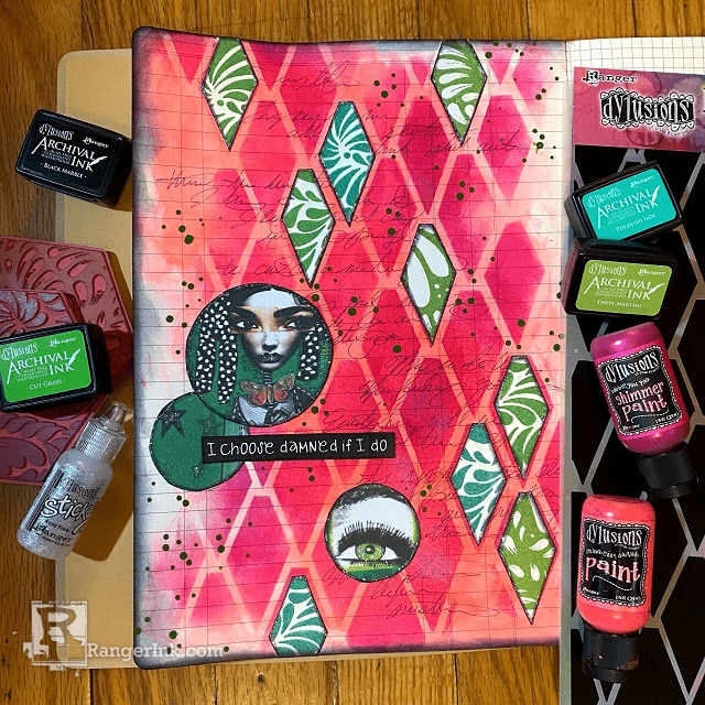
Dylusions Archival Ink Damned If I Do Journal Page by Jess Peters
Explore the latest Dylusions products in this journal page tutorial with Jess Peters! Crafted in the new Large Ledger...
Read More
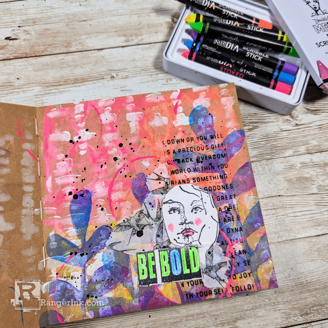
Unleash Creativity with Dina Wakley Neon Scribble Sticks by Laura Dame
Illuminate your journals with bursts of color and energy using the dynamic Dina Wakley MEdia Neon Scribble Sticks! Join Laura...
Read More